


Color is a wonderful thing. It influences our moods, brightens up space, and ultimately makes life far more visually interesting. Without color, we’d all be forced to live in a monotone world with little interest or intrigue— with color, the world is a stunning tapestry of different shades and tones, all weaving together to create a truly stunning home.
Most of us appreciate color, but it’s interesting to note that we focus on a select number of colors and shades. As demonstrated by this handy chart on htmlcolorcodes.com, there are literally thousands of different colors and shades… but we don’t use them. Instead, most of us stick to a standard color palette, especially when it comes to our home decor and design.
The classic home colors
When it comes to using color in our homes, there are a few rules that few of us deviate from. For example:
- Neutrals rule the roost when it comes to home design. Taupes, creams, whites, grays— basic colors that aren’t particularly inspiring but aren’t particularly offensive either. These neutrals are seen across our homes, from wall paint to soft furnishings, and have truly cemented their place as the dominant choice for home decor and design.
- Blue is an eternally popular bathroom color. In fact, as time.com explains, painting your bathroom blue could actually increase the value of your home— that’s some pretty powerful color psychology right there!
- Finally, it’s worth noting that, on occasion, another color or shade will soar in popularity and find its way into our homes. The best recent example of this is the shade “millennial pink”. As thecut.com discusses, this shade of pink has an enduring popularity that has surprised even the most dedicated home decor trend followers.
So you have the basics, the neutrals, and the colors that are specifically associated with a particular… but that’s about it. There are thousands of shades that just don’t make it into home decor: dusky peaches, emerald greens, bright turquoises, vibrant mustard yellows, deep plums. They’re all great colors, but most of us shy away from them; away from their boldness, their vibrancy, their willingness to buck the trends.
Perhaps it’s time to change all that. Infusing your home with unusual colors is becoming easier, with home decor leaders like deconovo.com introducing color options that few of us would have considered before. However, just because you have access to these colors doesn’t mean you know how to, or feel comfortable, using them— but if you read on, you should get a pretty good idea…
#1 - Trust your own opinion
If you decide to break the mold in any area of life, some people are going to be surprised. That means you may face a few questions or even surprised expressions from other people in your life. This is completely normal, and it’s important not to let it put you off continuing to add unusual colors to your decor. Just remember people are surprised as you’re doing something outside of the norm, not because your home doesn’t look good.
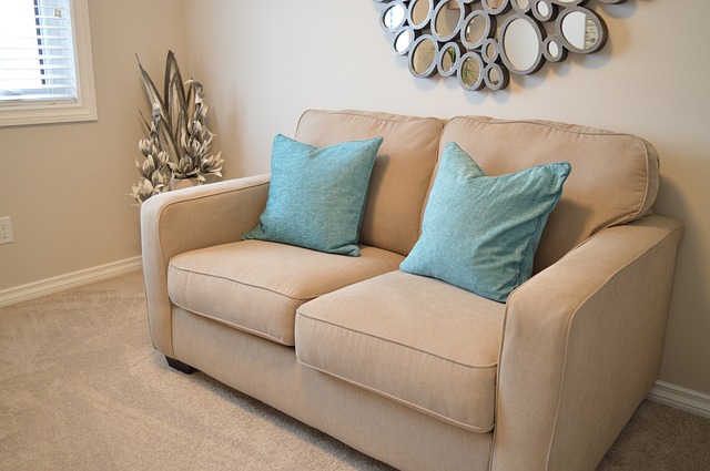
#2- Start using bolder colors gradually
If you suddenly start using bold, unusual colors everywhere in your home, the effect can quickly become overwhelming. So start small; perhaps a cushion in an unusual color, or a chair covering showcasing a shade you wouldn’t normally use. From there, as your confidence builds and you adjust to such bold, striking colors, you can develop your eye and introduce additional elements.
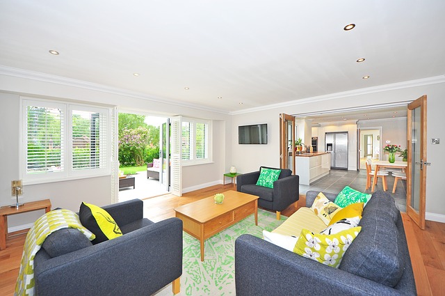
#3 - Stick to a single unusual color per room
If you take a neutral base and suddenly start splashing it with a wide variety of unusual colors, the chances are that the overall impact is going to be overwhelming. Bold colors are wonderful, but they tend to work best in isolation, with one color (or perhaps two, if the room is particularly large) being the “odd” choices for that room. Too many vibrant colors will soon create a hotchpotch kind of feel, which is far from the carefully cultivated color adventure you were hoping for.
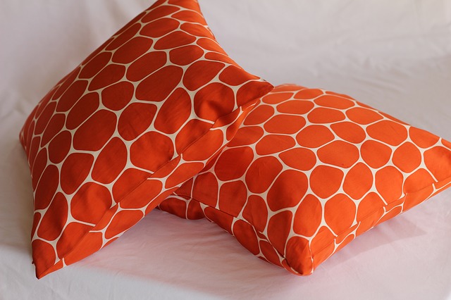
#4 - Use your unusual colors on easily-changed pieces
Above, we touched upon using colors on a cushion or chair coverings for a gentle introduction to color, but there’s an additional benefit to using these colors on soft furnishings: they’re easily changed. If your first venture into using bold colors is to try and paint an entire wall cherry red, then you’re more likely to spook yourself and feel overwhelmed by the sudden influx of unusual color. Rather than going extreme from the off, introduce unusual colors gradually on soft furnishings and ornaments that can easily be changed if you realize you find the color overwhelming. Only when you have successfully used bright colors in these areas should you move onto using bright colors on semi-permanent features such as walls, ceilings, and flooring.
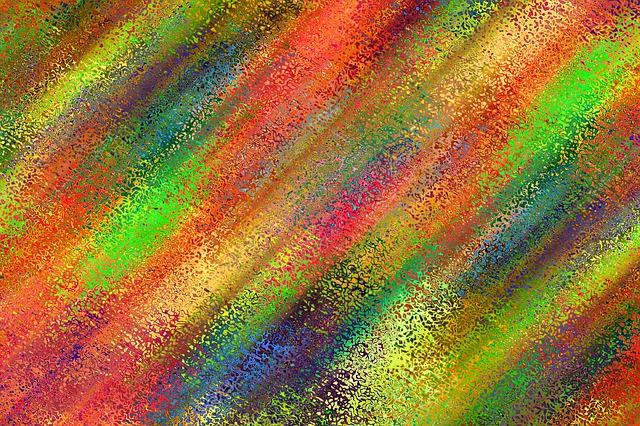
#5 - Use patterns with caution
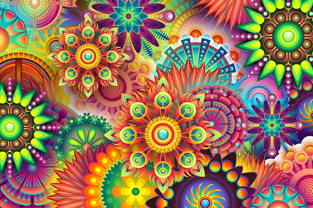
When combining patterns and bright colors, you have to be very careful. A perfect example of this is shown in the image above This combination of bright colors and a pattern only really works in a small area; you wouldn’t, for example, choose the top image on this post as wall art (unless you wanted to cause yourself a few headaches, anyway!). Realistically, patterns formed from brightly colored elements should be very simple and basic; simple geometric lines, for example. Anything more intricate and the overall effect becomes overwhelming, and can actually detract from the individual visual interest of both the color and the pattern, so use this combination sparingly for the best results.
In conclusion
By choosing to use bold, unusual colors in your home, you’re really emphasizing your individuality. You’re able to enjoy the benefits of using rich, vibrant colors to distinguish your home from all the taupes and blues that dominate other residences— and ultimately, forging ahead with your own sense of style is far preferable to following the crowd.


